Right around December, Pantone announces its Color of the Year.
Around this time I’m always left wondering: Is it really a super useful marketing and design trend and well-thought-out calculated forecast?
Or is it more of a Groundhog seeing\not seeing his shadow kind of a thing? Let’s dive in to find
out.
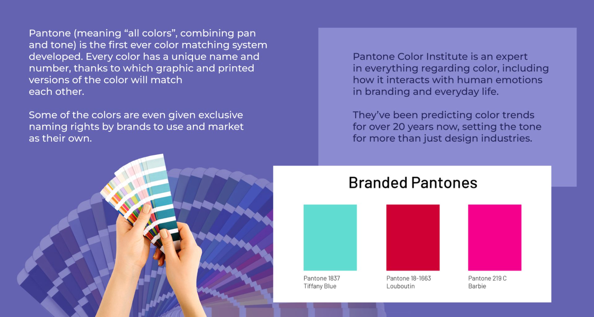
Source: http://www.shoppedonline.com
Pantone Color of the Year for 2022 is Veri Peri; announced as a huge immersive art event, it got lots of social media coverage via original content using this color, collaborations, hashtags, articles, and so on. This obviously helped to skyrocket the engagement levels for Pantone, while giving opportunity for other brands to jump on the Veri Peri bandwagon.
So, is Veri Peri very trendy?
For sure, this color and its variations are one of the design trends projected for 2022.
Many 2022 design-trend articles do not list any specific colors by name or hue, but there’s a high concentration of violet colors spread throughout.
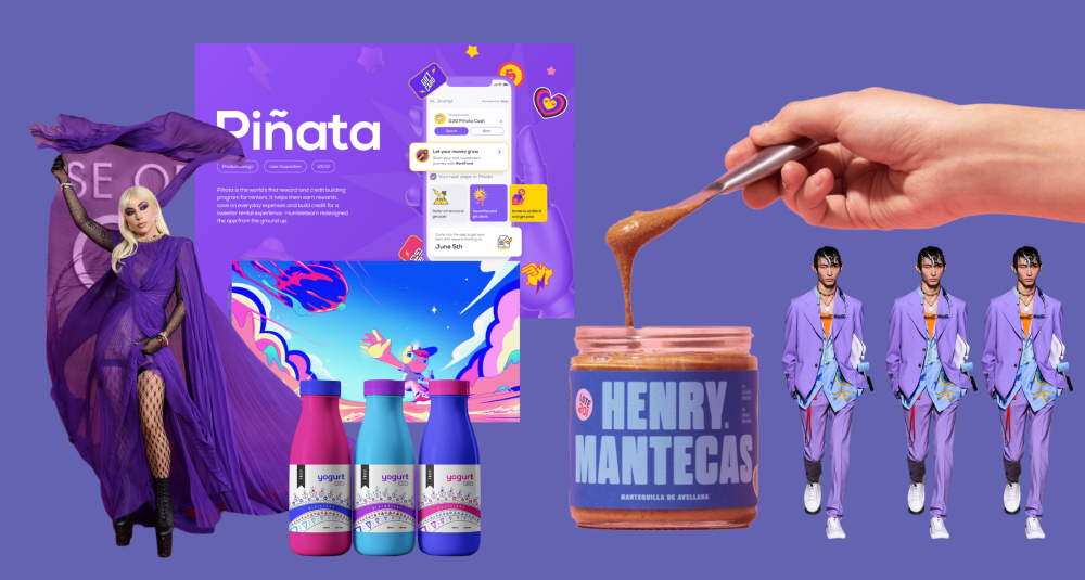
Source: https://www.popsugar.co.uk
https://www.behance.net/gallery/133296431/Henry-Ma…
But if you take a look at the popular marketing campaigns and designs – it’s not like the violet color is dominating, it’s just one of many gem-tone palates popular for 2022. Basically, keep calm and use it responsibly.
Put the oxygen mask first on your purpose, then on your design trends
Some designers and business owners have a tendency to use design trends literally in everything they do. Sometimes it may work out ok, but often it can result in missing the desired marketing results and just being gimmicky and/or illogical.
Imagine a medicine for elderly people with a super trendy packaging design. Or a charity organization for the homeless done in lush purple and with an astonishingly beautiful but unreadable font. It may be cool for winning design awards this year but not appropriate for the brand’s purpose of day-to-day interaction with the customers.
A good designer has a unique approach for every project and every brand. If a trendy animation, font or color is something that will help the project to reach its goal – amazing, use it, love it, and don’t hold back. But if there isn’t a strong reason to implement the color trend, use sparingly and smartly.
Ok, how exactly do I use it?
It depends on the market you’re operating in, what product you are working with, your end goals, and your target audience.
To hype or not to hype
First, you can use the newsworthiness of the announcement itself. Catch some hype right when the color is out – getting in on the action ASAP in the first week or two – by creating fun original posts, designs, something creative, beautiful or whimsical.
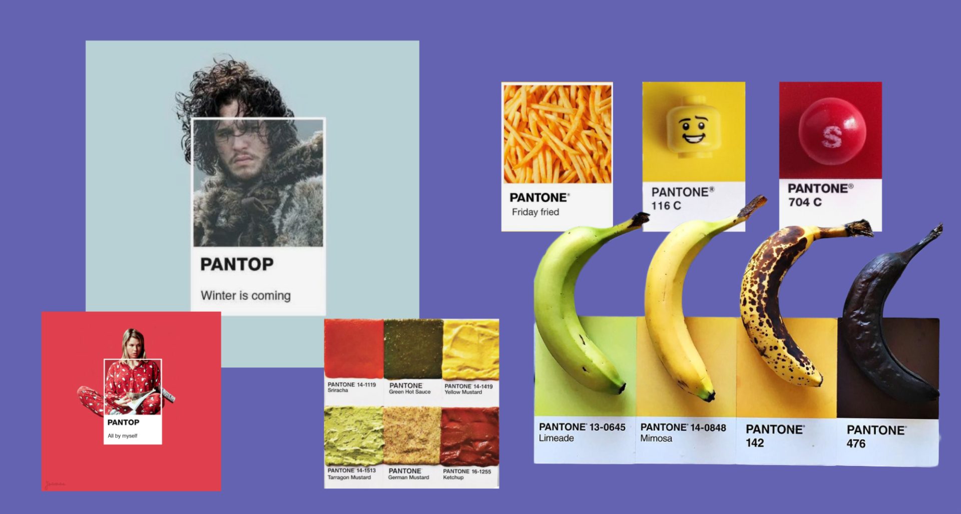
Source: https://www.pinterest.com/pin/212865519876996099/
https://www.pinterest.com/pin/4714774595121910/
https://www.pinterest.com/pin/680465824952165437/
https://www.pinterest.com/pin/4925880833260753/
http://www.fubiz.net
Be careful not to make grand statements with long term consequences, potentially harming your brand. For example, some companies post something like “look, our brand colors are trendy this year”. Cool, but does that mean your style is not trendy any other given year? Are you planning to do rebranding every year? Didn’t think so.
You may also want to do collaborations soon after the announcement; jumping on this viral wave can definitely bring you a lot of benefits in the form of the number of your subscribers rising, overall brand awareness, and sales.
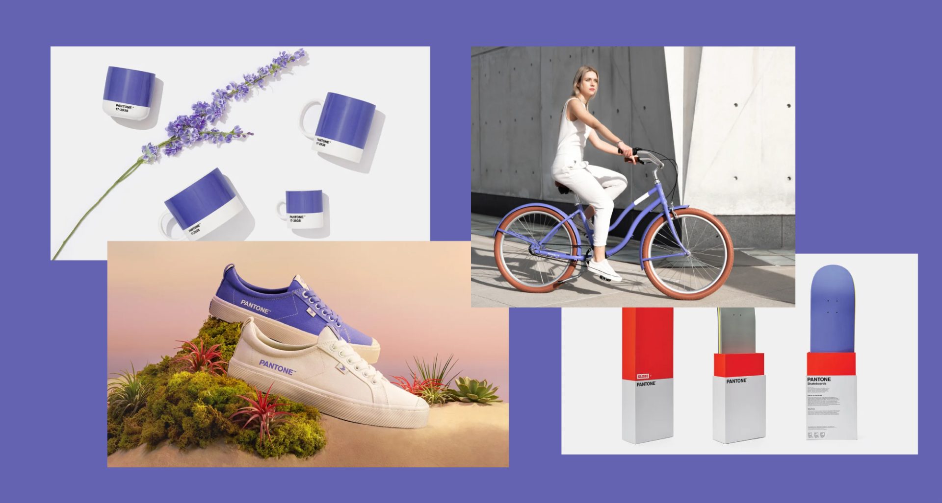
Source: https://www.pantone.com/hk/en/color-of-the-year-20…
https://fashionista.com
Upgrade your portfolio to premium and get unlimited matches with potential clients!
Pantone Color of the Year is an opportune time for design studios and even freelancers to take their time and create something truly unique, innovative, and bold on the foundation of the color itself. A project unrelated to any client and free of any external commands could be a great personal project for enhancing your own portfolio.
Guilty as Charged: we used Pantone Color of the Year for branding in
2019
SAPHIRA agency created a logo and the whole nine yards (brand identity, brandbook, social media strategy and design, website, etc) for DGY investments – real estate and property management company – using “Living coral” while it was still trending. And we stand by this choice, because it was ideal for the specific marketing goal DGY had.
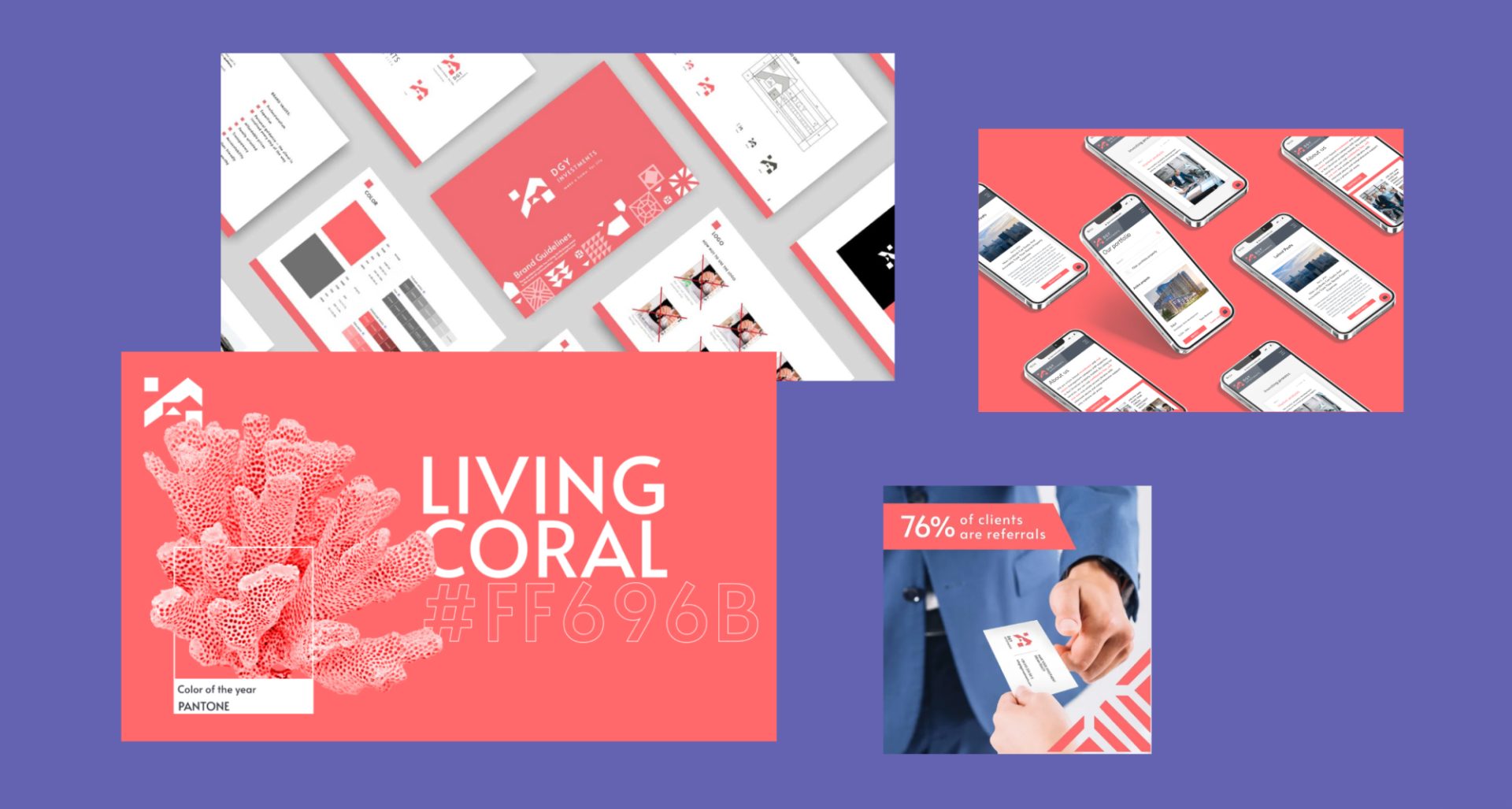
We conducted a research and found that most of the competition uses very serious, dim and dark colors, mostly blue or brown in their branding materials. According to DGY’s positioning, the company wanted to stand out and convey a message that DGY will take care of everything, while also being your trusted partner along your investment journey. Our strategist came up with the word “Invest-mate” to explain it all perfectly. Therefore “Living Coral” was the right strategic choice, as well as beautiful and trendy. It also works well for the brand alongside the complementary grey color to balance friendliness\seriousness or invest\mate ratio. The fact that this color was recently the Pantone Color of the Year and was still one of the design trends at the time didn’t hurt, but was not even in the top 3 reasons for choosing it for DGYs visual system.
The Devil wears Pantone
When a particular color is trending, you’ve got a Devil wears Prada situation on your hands.
Remember the scene about Andy and the blue cerulean color sweater? She thinks she picked it herself, but in reality, her choice was subconscious, or rather “inceptioned”. See, the fashion industry implemented this color in their collections earlier that year and therefore was simply everywhere, including the store in which the protagonist (Andy), a person who is as far from fashion as one can be, purchased her sweater.
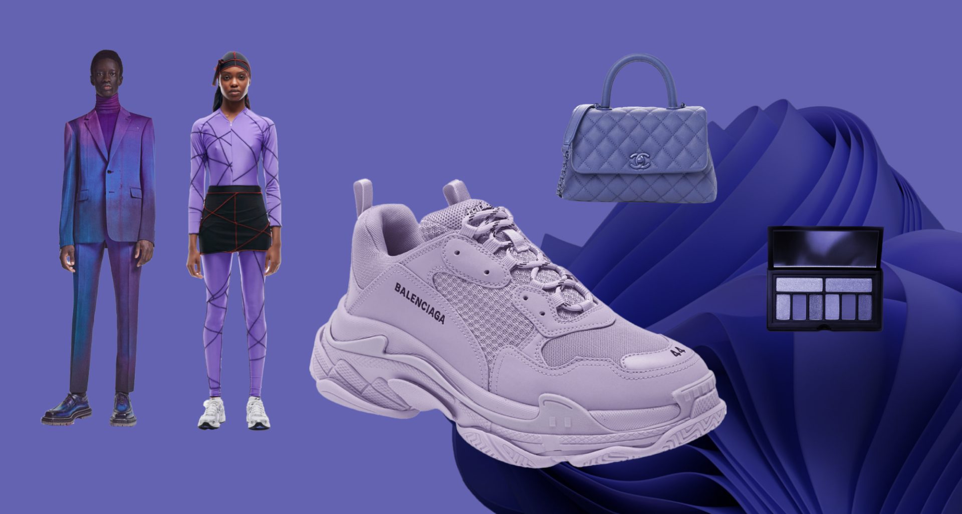
Veri Peri has traveled far fashion-wise already and as we know, that’s always an indication that other industries will start using it as well.
Source: https://news.microsoft.com/ru-ru/windows-color-of-…
https://www.mansworldindia.com/style-luxury/the-ve…
https://thecurvyfashionista.com/very-peri-fashion-…
If you are not following trends, they are following you wherever you go
For sure there are people who want to own an item simply for it’s “trendiness”. They want to possess such items not only for everyday functional use, but also as a thing of beauty and style that signals to the outside world “I know what’s in. I am up-to-date in all things design and fashion.”
Then there are most of us who aren’t motivated by how “in” a certain color is. You may use an old mug for your tea and not even notice it, or you might choose to buy a specific color mug to match your drapes and table. However, in doing so you may be subconsciously influenced to buy a new mug in a trendy color. Perhaps you are seeing this color everywhere on your feed or on the street and voila – you’ve bought a new mug in the exact trendy shade.
If you work on an everyday product line and there’s room for a new color in your collection, then a Color of the Year edition would certainly enhance your sales. It’s most of all useful in products that can play on this unconscious need to have the trendy color around.
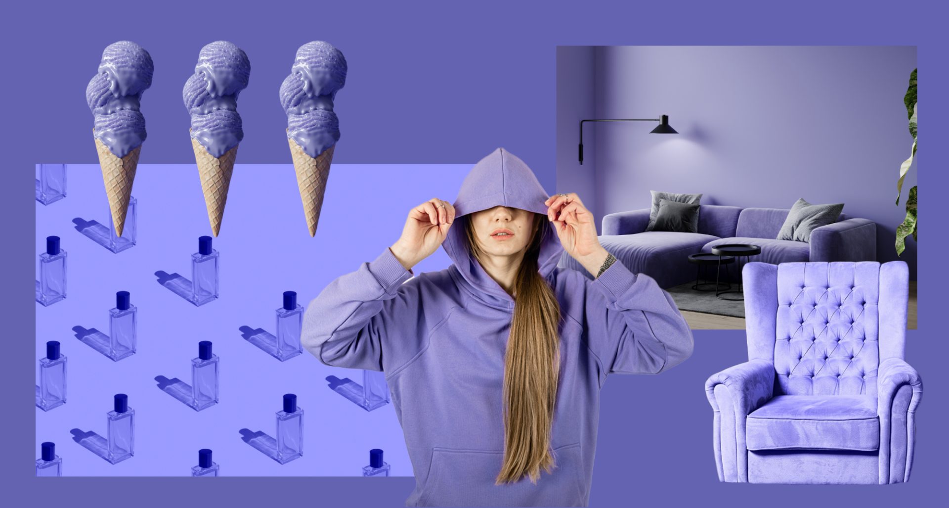
Coming back to the Devil wears Prada movie scene, it’s a good idea to create a sweater or a pen, a tablecloth, or a portable speaker in a new trendy color and sell it to “Andys” of the world.
However, it’s not a good idea to use this color for the Vogue rebranding just because it’s Tuesday and Pantone says so!
In conclusion, design tips:
Do create engaging content on the topic in the first weeks starting from the announcement. This approach does a great job promoting brands that catch hype during the first phase after the announcement, so utilize this with lots of inter-industry collaborations!
- As a business owner or designer do pay attention to the color announcement, just as you would to other trends that are relevant in your field.
- No, don’t use it in your project without a particular reason. Always think about your unique marketing goals and your brand\style\target audience\current situation.
- Yes, definitely do use the color if it helps you to convey the right message and deliver the right emotion.
- Do extend your product line with the trendy color items (especially if that’s a design for life kind of a situation) if that makes financial sense in your manufacturing process.
- Yes, yes, yes if we are talking about fashion brands that are more or less flexible regarding design trends DO implement Pantone Color of the Year!
Brands may use trends and brands may create trends.
Both options are equally valid, it’s just that you have to know which one to choose in your particular situation. Hope we helped you with that today.
And get ready to notice Veri Peri everywhere at least for a week, not just because of it’s trendiness, but because our strange human brain makes us notice things we read or talk about. But that’s another story for another time:)


