Design is a constantly developing, ever-changing industry, and logos are not exempt from this creative evolution.
Logos are a trickier design element though, as one can’t just change their trademark with every whim and trend that pops up. Renovating your logo can be applauded as a rounding success or be a mockery of a once highly recognizable and respected brand. With that said, it is important to know that logo rebranding is a customary practice and should be embraced when the time is right. In this post, we’ll showcase some current trends and put in our predictions for the future of logo design in 2022.
Come on, Do the Logomotion
With a higher ratio of mobile to desktop users and less money being spent on print ads, logos are not confined to being static anymore. Instead, they can interact, move, jump, and dance for the viewer, ticking all the creative boxes a designer and business could dream of. Termed “Logomotion,” these visual nametags are a combination of 2D and 3D animation that snag the public’s attention for a duration longer than an unanimated logo. Designers can create complex layers and even storytelling through a logo’s animation.
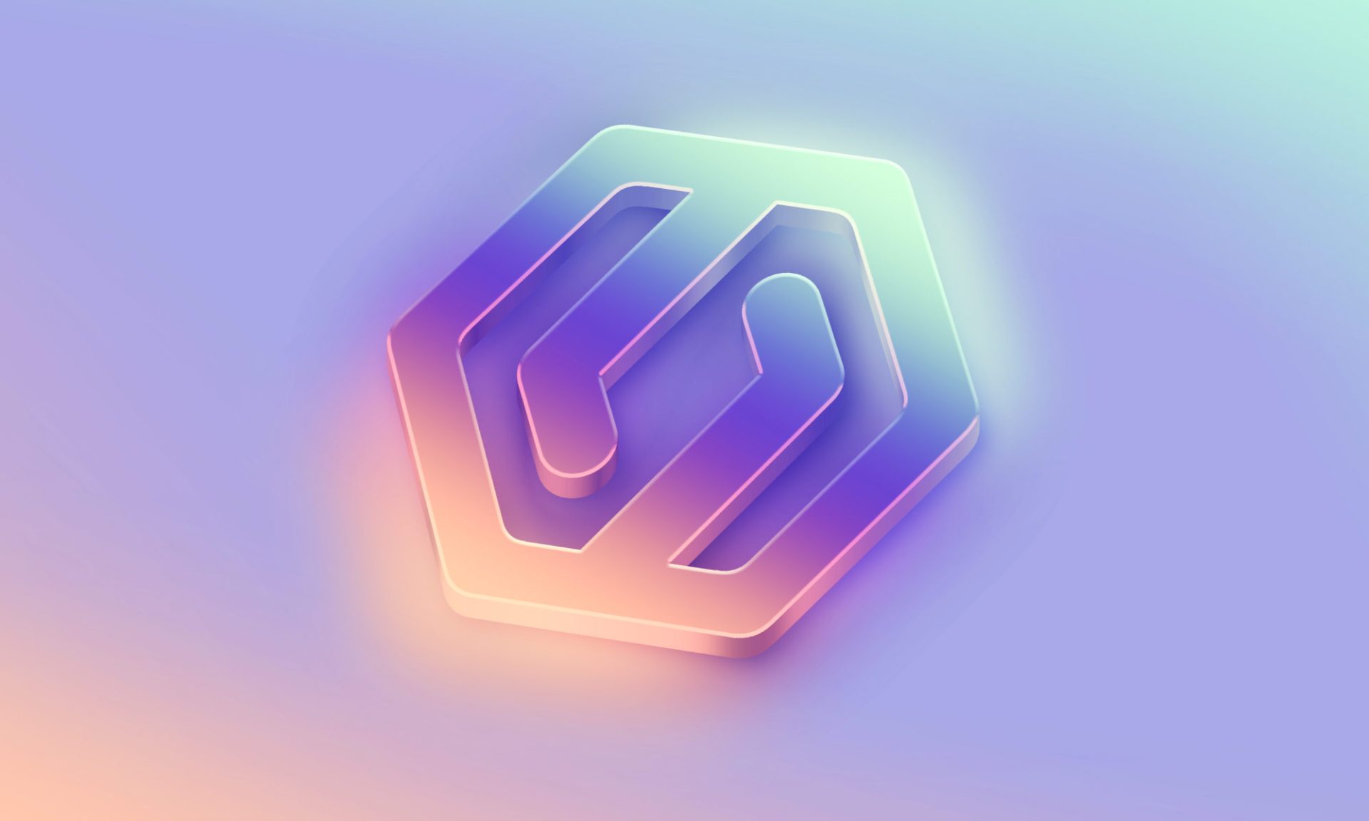
50 Shades of Gradient
3D gradient logos not only look good on the screen but also allow for designers to employ a spectrum of beautiful colors and shapes. The ability to highlight and contrast within a single logo can be quite striking and effective. Gradient shading is perfectly coupled with geometric, sometimes psychedelic, or angular shapes. These experimental contours can often be abstract and unusual but need to keep a clear and recognizable impression on the observer. With the 60s and 70s midcentury modern look dominating design right now, logos have taken on lava lamp vibes, often creating bubbly, whimsical, and groovy patterns.
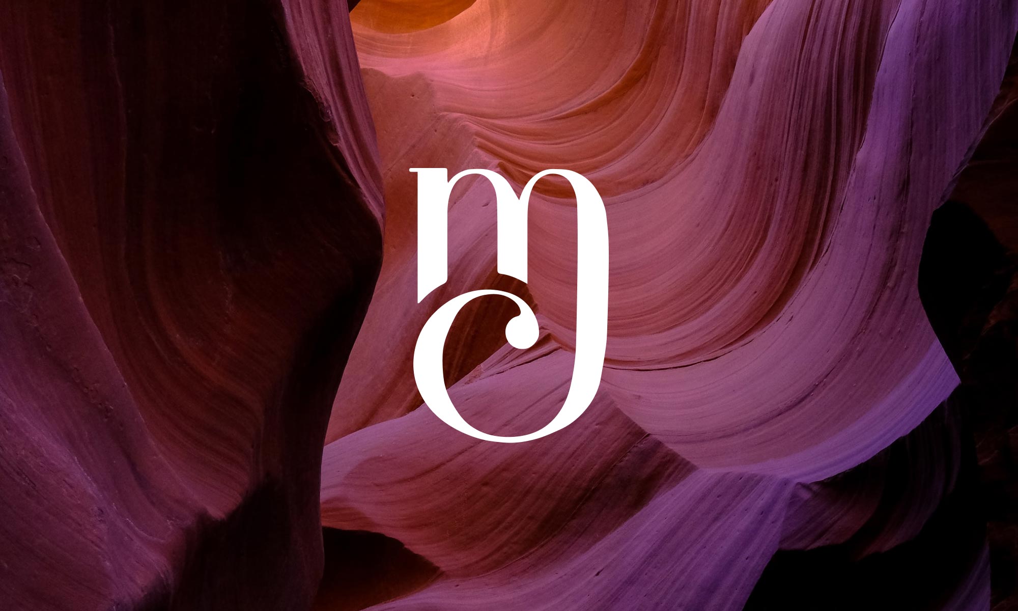
When Two (Letters) Become One
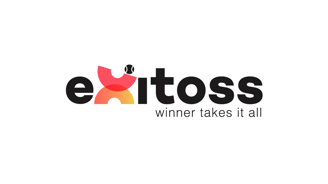
A clever logo design hack is the trendy “letter merging.” This usually consists of combining the latter half of one letter and the beginning half of the other to create one singular letter. It is just enough of an optic trick that one takes notice but not so much so that you can’t recognize what the word is. This gives leniency for using a simpler or more classic font, while adding creative a twist. In a similar vein, text overlapping and “fading” letters (letters missing part of their stem) are a modern and simplistic contribution to logos.
Hip to Be Square
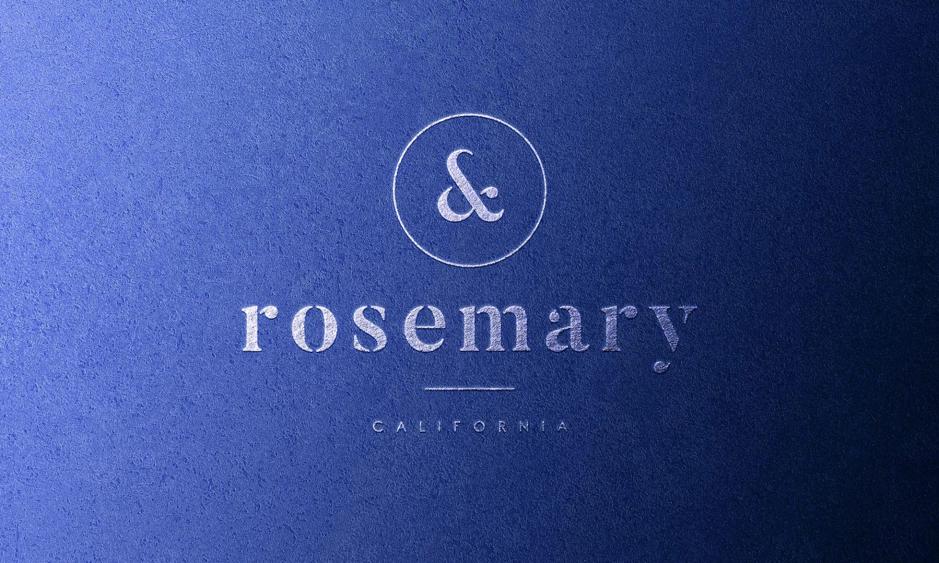
Typographical logos with modest colors and conservating design are nothing to be sniffed at. Netflix, one of the largest Fortune 500 companies, is solely its trademark name in red ink within a slightly rainbow arched curve. This design method is called Wordmark and is a tried-and-true favorite in logo design. Likewise, Coca-Cola has unchanged its iconic signature style logo since 1905, and with inequitable recognition. Sometimes the strongest logo is simply, boldly, uncomplicated: “NAME.” Approachable, clean fonts like Serif are a popular choice as they appeal to traditionalists while also imbuing a sleek and modern aesthetic.
Time to Say Goodbye
We forecast that the aughts era graphic-tee-ink-stamped and emblem logos will decline in popularity. That’s not to say that ink-influence or brushstroke typeface will be discarded, but the “seal of approval” look will undoubtedly, and perhaps thankfully, be disapproved of. Taking the place of embossed style insignias are new friendly mascots: cheerful and nature-inspired flora and fauna that enchant and entreat any visitor to enter the brand’s magical world with the flick of a tail or wave of a palm frond.
As you can see, logo-land is a metropolis of design and creative countryside, with undiscovered expanses and potential innovative frontiers. Logos are the ultimate design challenge – as they need to be modern and hip, while simultaneously being constant and timeless. For optimal longevity, choose a logo that incorporates classic design theory and accompany it with a touch of progressive styling. When in doubt, using a professional agency can give you that security and extra edge your company’s nametag is looking for, keeping you relevant, relatable, and most importantly, readable!