50 Milliseconds to Make a First Impression
The Advantages of Clear Website Design
Snap your fingers!
It takes 50 milliseconds to make a first impression on your website visitors, about the same time it takes to snap your fingers.
It’s so important to have a clearly designed website to make a good first impression. More than one-third of website visitors refuse to engage with a website that’s cluttered or unattractive.
What happens when a website is difficult to use and confusing? New business and revenue could be lost to competitors and customers could abandon interest in your products or services.
Behavior varies from sector to sector. In the online retail business, for example, 88 percent of users will not return to a website if they have a bad shopping experience.
How many businesses fail because of a badly-designed website? The answer is a shocking 70 percent of businesses fail because of something that could easily be avoided or fixed with the right approach.
Web usability doesn’t seem to be a glamorous choice of topic, but paying attention to it can make your website sparkle and stand out from the competition. Clear design is fundamental to the success of your website and your business.
Don’t make me think
“Get rid of half the words on each page, then get rid of half of what’s left.” Steve Krug.
Probably the most famous author on the subject of web usability is Steve Krug. His book, Don’t Make Me Think, a Common Sense Approach to Web Usability, is a classic resource for anyone involved in a website.
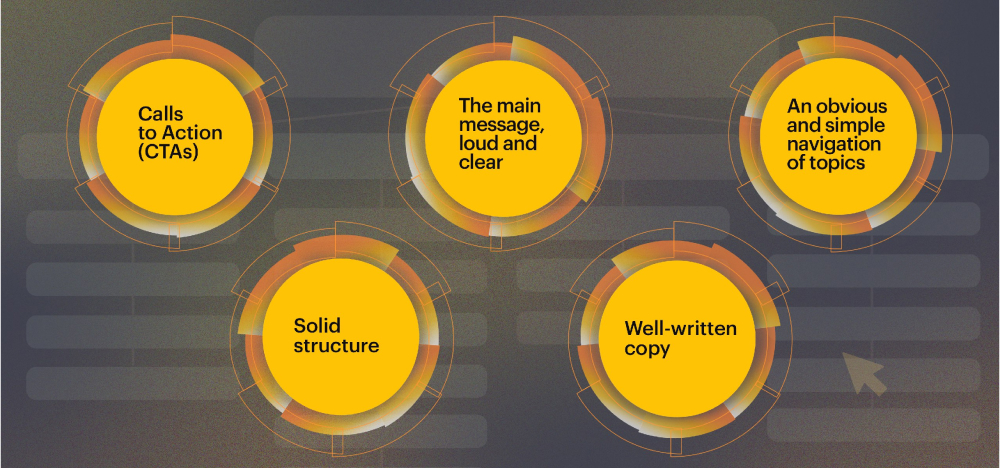
Steve Krug wrote that nothing important should ever be more than two clicks away. The question is, what is important? It depends on the company and their priorities. SAPHIRA Agency helps clients to highlight what’s important by usability factors such as:
- Calls to Action (CTAs) to convert visitors into new customers
- The main message, loud and clear
- An obvious and simple navigation of topics
- Well-written copy
- A solid structure

Calls to Action (CTAs)
What do you want your website visitors to do? They’re here now and it may be your last chance to convert them into new business.
Design agency SAPHIRA has an experienced creative team who plan the CTAs based on our clients’ strategies and main business goals. Planning happens early during the briefing process, giving our clients the best chances of focusing on a successful flow of conversions.
The main message, loud and clear
Some examples of main messaging are Coca-Cola’s ‘Enjoy’ and ‘Happiness in a Bottle.’ As a web design agency, we know that messaging informs the whole direction and identity of the websites built for our clients. Think of messaging as the signpost leading the way to the visitor’s ultimate destination: a conversion point with an irresistible call to action.
An obvious and simple navigation of topics
Adobe emphasizes the value of minimalist clarity as the most appealing way to engage a website visitor. Our web design service features designers with at least five years’ experience, who are experts at creating simple and obvious pathways to lead website visitors through a clear funnel of action.
Well-written copy
Good copywriting is more than just important, it’s crucial to the success of your brand and conversion rate. Each word has the potential to result in conversions that produce revenue and add to your customer base.
SAPHIRA’s content writing team works closely with our creative design studio to make every word count. Each writer is experienced in a wide range of sectors ranging from financial services to music products and many others in between.
Solid structure
Our web development team builds website structures in close coordination with the design and content writing teams, meaning a consistent and uniform approach from start to finish.
A well-planned website with experienced designers, developers and content writers is within your reach with SAPHIRA Agency. Whether you need a new website or are unhappy with your current website, our experts can help.
Book a meeting with our Client Service Manager to discuss how we can help your business.


