Virtual Pay

Turning a local financial services provider into a bridge for global transactions

Fintech

Logotype | Identity | Branding | Website | UX/UI | Web Development | SEO

Challenge

To help a regional company go global and to make complex financial services simple, direct and easy-to-understand through design

Approach

We abandoned the typical techniques and imagery associated with fintech companies and created branding that represents how the company builds bridges, connecting merchants and buyers from around the world

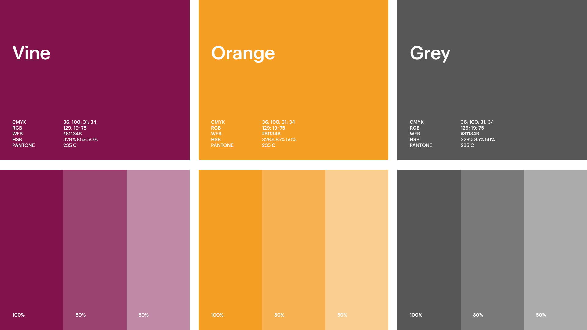
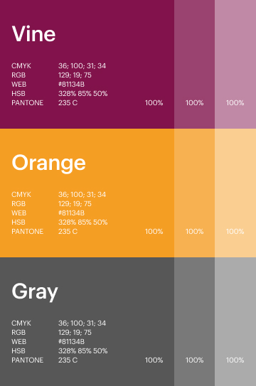
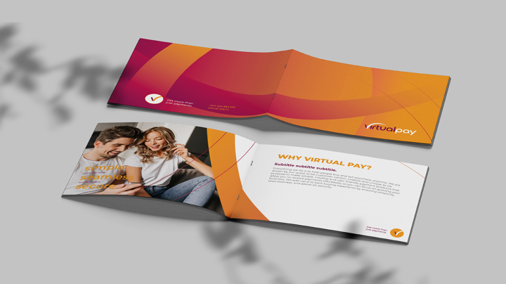
Taking inspiration from the company’s founding site, we created a beautiful palette reminiscent of Kenya’s breathtaking landscape.

Branding

A whole set of POSM was developed, providing clients with the same look & feel. Easily recognisable and memorable.

Visual style

A bridge "arc" was used as a basic graphic element both for background patterns and foreground compositions.

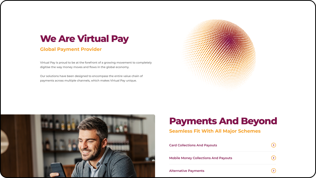
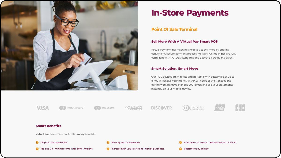
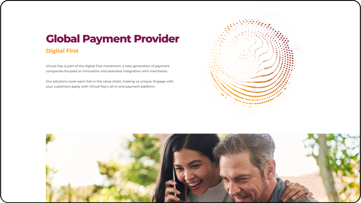
We built a comprehensive yet multifunctional web platform, representing all Virtual Pay services in one place. Fully mobile-friendly and SEO-optimised.

Key UI principle

Space and connection. All information was simplified and divided into logically organised units, one piece per one visual block.

Credits

Shira Schapiro

Art Director

Maryna Kosareva

Graphic designer

Oleksandr Lukianchuk

SEO Team Lead

Maksym Kuzmenko

Creative Director

Creative Director

UX/UI designer

Oleksandr Zlatokrylets

Developer

Tetiana Kholbobaeva

Design Team Lead

Sarah Fenwick

​​Content Team Lead

Olga Stebeneva

Project manager

Olena Sergeeva

Graphic designer

Baska Ganbaatar

Content writer

Anna Mantrova

Project manager

From the lavender field to the
recreation park:
360° campaign for Poradiv Park
Brand strategy | Logo update | Branding &  SMM kit | Website | Communication strategy | Creatives for promo
Histogram. The unknown history of Ukraine
Creative idea | Naming | Logo | Website