Poradiv

From the lavender field to the
recreation park:
360° campaign for Poradiv Park

Entertainment

Brand strategy | Logo update | Branding &  SMM kit | Website | Communication strategy | Creatives for promo

Challenge

Once upon a time, there was a beautiful and magical lavender field near Kyiv. Every season, photographers and models would visit it from near and far, in the quest of taking beautiful Instagram photos.

However, the concept of the "photo field" was very restrictive for the owners and it didn't allow the business to grow. So, they approached us with the challenge of changing their brand and repositioning them entirely.

We were faced with a real challenge: to change the perception of the location and attract 20,000 visitors to Poradiv. And all of this had to be achieved within a month of work (since lavender bloom lasts for only 4 weeks) and during the war in Ukraine 😱

Brand Idea

Calmness. Energy. Lavender.

First, we conducted an in-depth market analysis and reached several key conclusions:

  • The market is quite saturated, but there are still untapped territories of calmness and health in our category.
  • Competitors primarily target two audiences: families with children and photographers and models.
  • The war has caused significant changes in audience behavior: the level of stress has increased, and there is a growing demand to overcome it. At the same time, the potential male audience is currently difficult to reach (some are serving in the military, while others avoid traveling due to suburban checkpoints).
Taking all of this into consideration, along with the product itself (lavender is known for its soothing properties), we have decided to reposition the client's business as the first lavender recreational space for women in Ukraine.

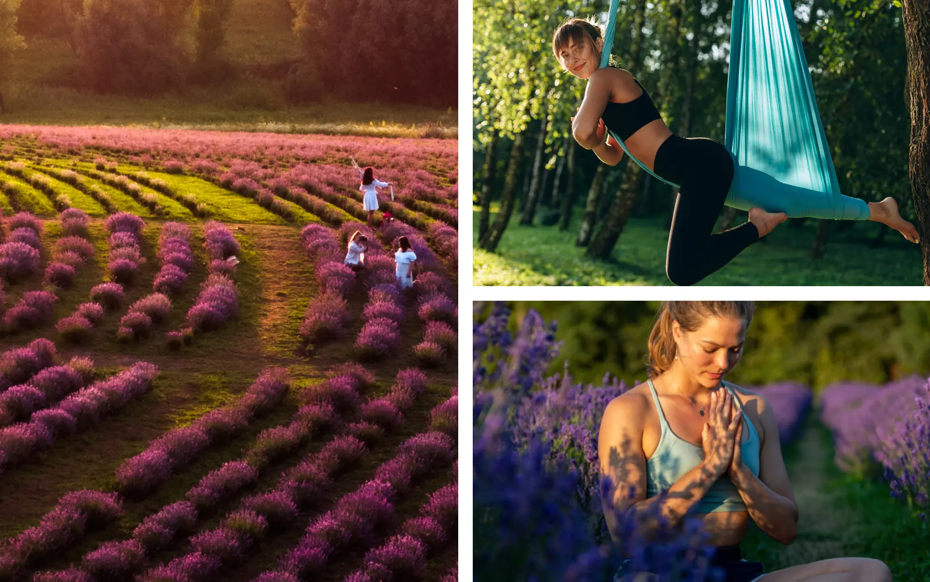
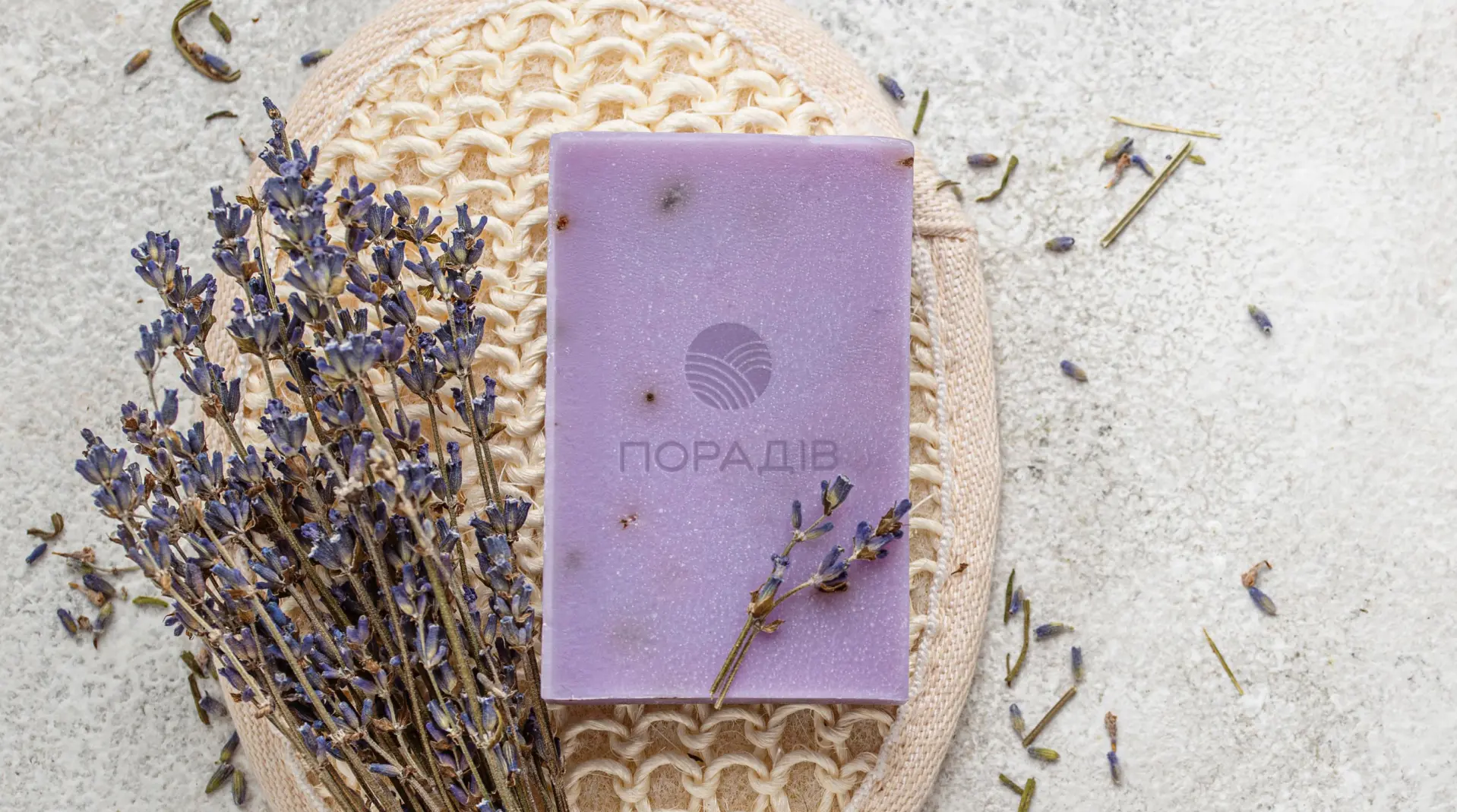
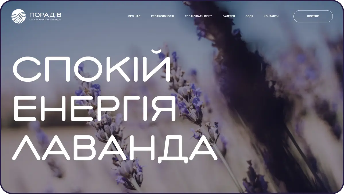
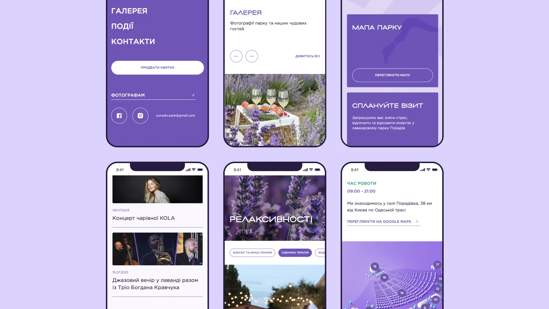
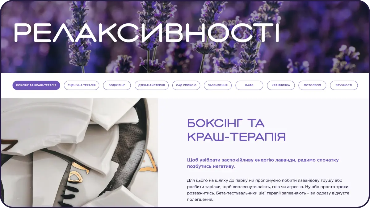
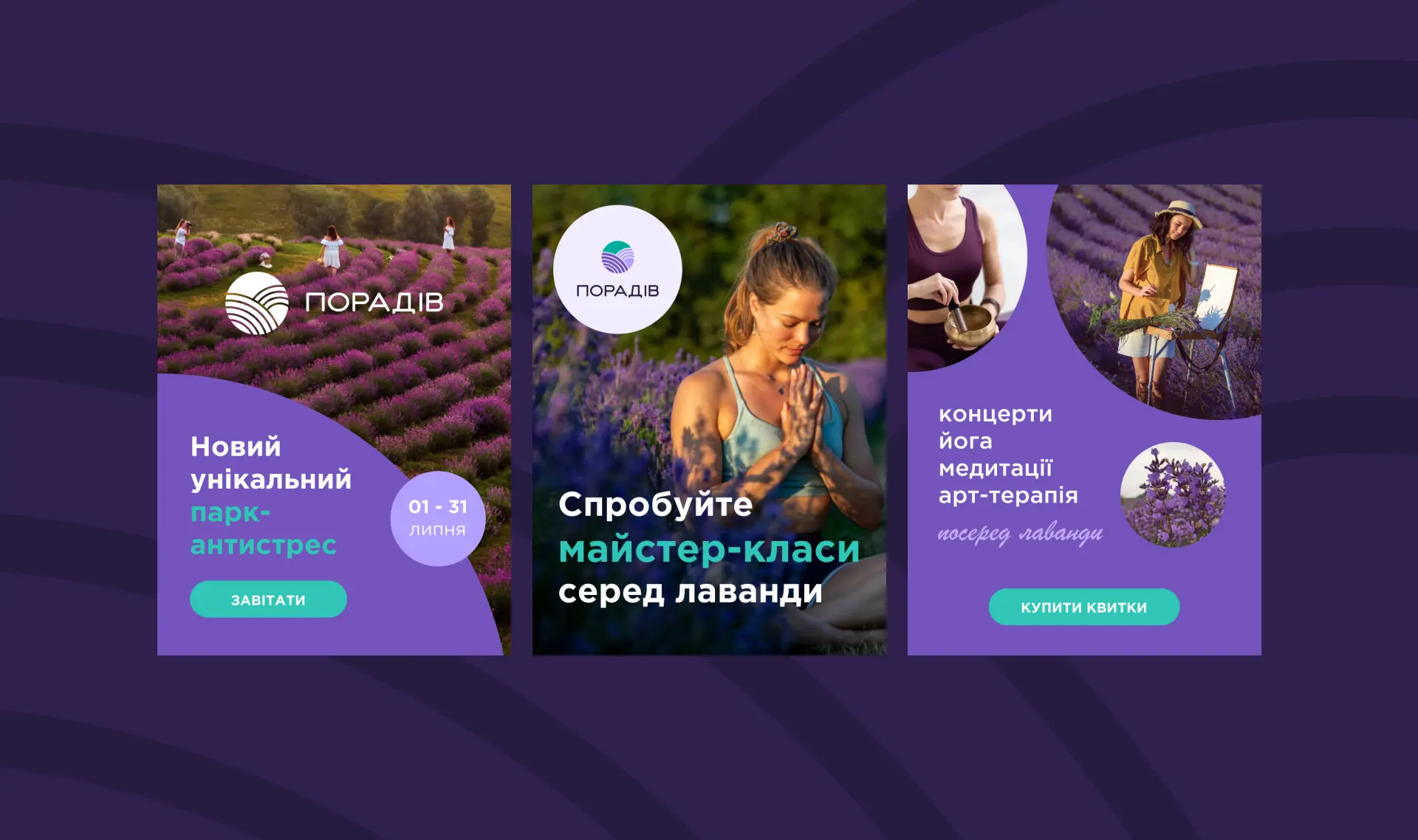
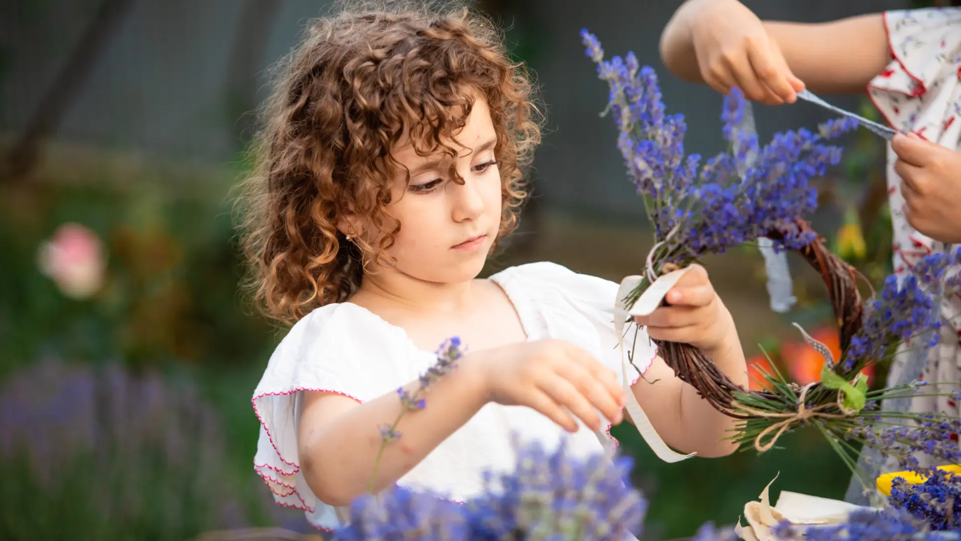
While the client was busy building the relaxation infrastructure of the park — a hub for yoga and meditation sessions, a space for art therapy, a stage for live music concerts, and more — we began working on the rebranding of Poradiv.

Logo Refresh

Feeling connected and reminiscent of their old logo, our client was interested in aligning the logo with the new positioning in a gentle and loving hand. So,  in order to give it a more modern, exciting, soft and inviting effect, we made the shape more open and light, removed the "frame" and sharp angles, replaced the font and descriptor, and chose colors that breathe calmness and the freshness of lavender.

Website

The website and social media platforms are the primary points of contact with potential park visitors. Therefore, we developed a new website for Poradiv - informative, functional, aesthetic, and modern.

Here, users can find all the necessary information about Poradiv and purchase online tickets, and also experience the atmosphere of the relaxation park through a sensory design.

SMM kit

To ensure consistent communication for Poradiv across all channels, we developed a branded design system for social media platforms.

Creatives for promo

We also created all the creatives for the advertising campaign, including videos, banners, and PR materials.

Results

We  built a strong brand for our client. One that goes beyond the paradigm of being just a "photo spot" and sets the park apart from its competitors, allowing the business to thrive. 

Annnddd… The risk paid off! in July 2023, the park welcomed more visitors than in previous seasons.

Credits

Yelisey Stratienko

CEO

Vlad Annych

Senior Graphic Designer

Igor Gana

Development Team Lead

Shira Schapiro

Art Director

Olha Tsybarovska

Graphic Designer

Anton Demydov

Developer

Julia Borhulenko

Creative Director & Strategist

Maryna Myshanska

Motion Designer

Kristina Naumenko

Project Manager

Tanya Kholbobaieva

Design Team Lead

Ivan Kondratenko

Senior UX/UI Designer

Partners

Media&Performance advertising agency MixDigital

Histogram. The unknown history of Ukraine
Creative idea | Naming | Logo | Website
Brand Identity for MOR,
a leading Israeli building products company
Logotype | Identity