Haredi Tech

A modern logo bringing the high-tech world into the orthodox community

Education High-tech

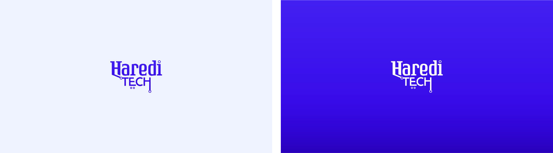
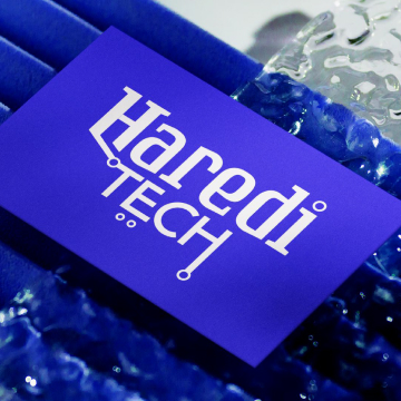
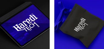
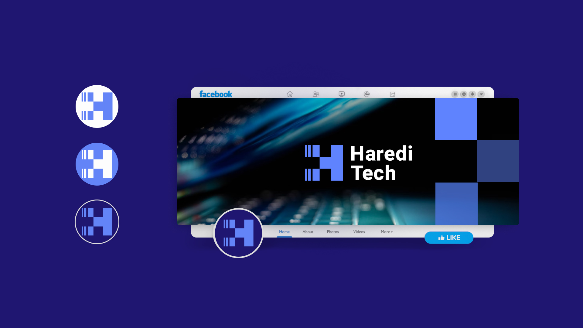
Logotype | Identity | Branding

Challenge

Create a logo for a unique program that is a collaboration created by "The Toronto foundation", "Israel Innovation Authority" & Career 21", designed to connect two different worlds in the Israeli-Jewish society.

Another world

A unique program called Haredi Tech helps integrate English-speaking members of the ultra-orthodox Jewish community into the high-tech workforce. Since members of this community usually receive only religious education, they have difficulties finding employment since they do not have a formal high-school or university education.

This program offers a very practical and useful training in various hi-tech fields. Such training, alongside English proficiency, is the key to finding a high-paying job while becoming a valuable addition to the workforce.

Due to its design, this program caters to the specific needs of this community, such as separate classes for men and women (as it is required by faith in this ultra-orthodox community), and flexible hours that coincide with religious schooling and family commitments.

We have developed 4 unique options for the logo, each connecting to a different facet of the project:

1
In this version, we combined the form of the Gemara texts (which are studied in the ultra-orthodox community) and the coding language, demonstrating their similarity.
2
In the second option, a typographic combination plays between an old-style font that corresponds to serif texts from prayer books and a modern font with a hint of a digital language.
3
The third option contains a dome-shaped element in the letter "H," which resembles both a yarmulke (kippah) and a bridge or tunnel, symbolizing the connection between both worlds.

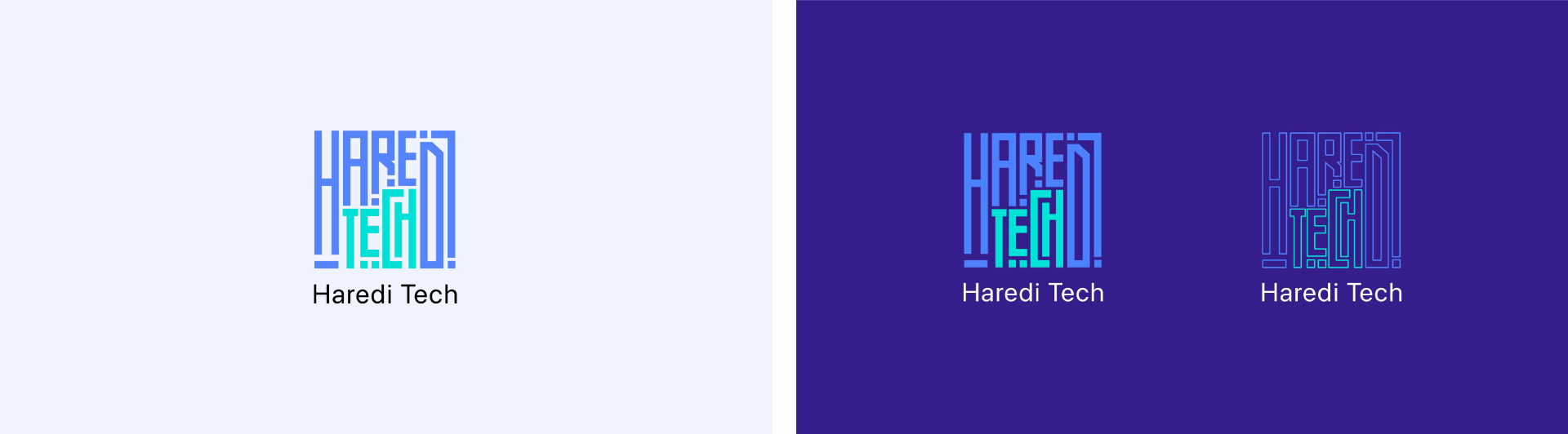
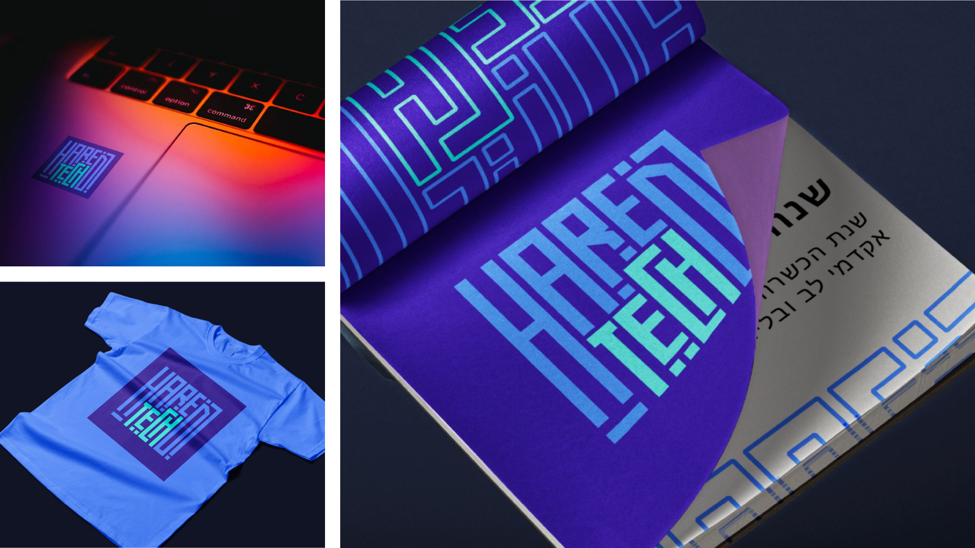
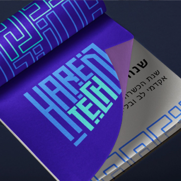
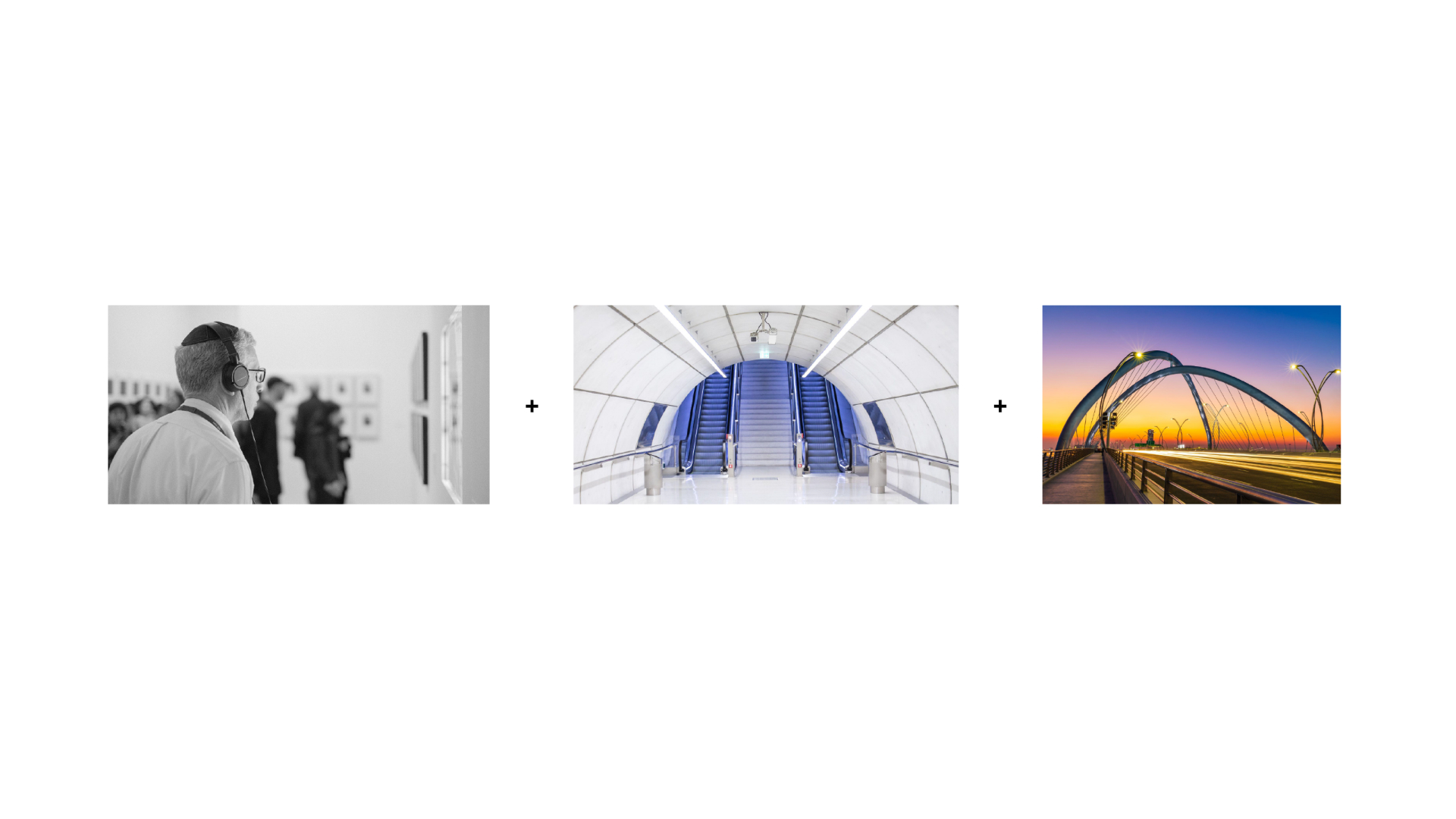
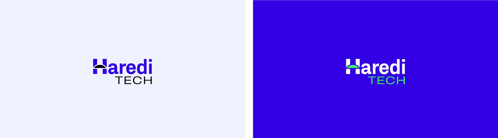
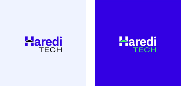
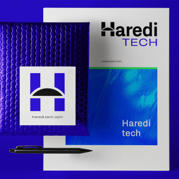
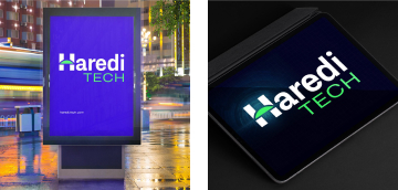
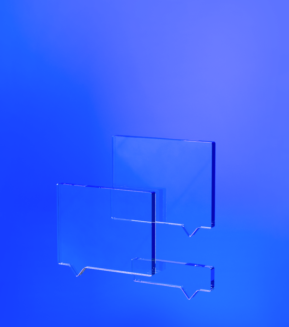
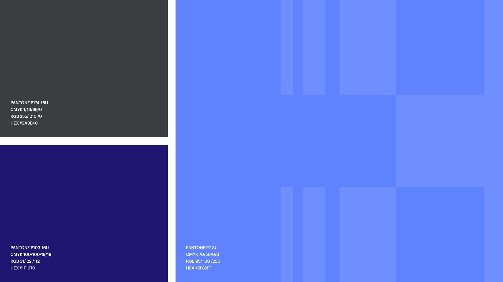
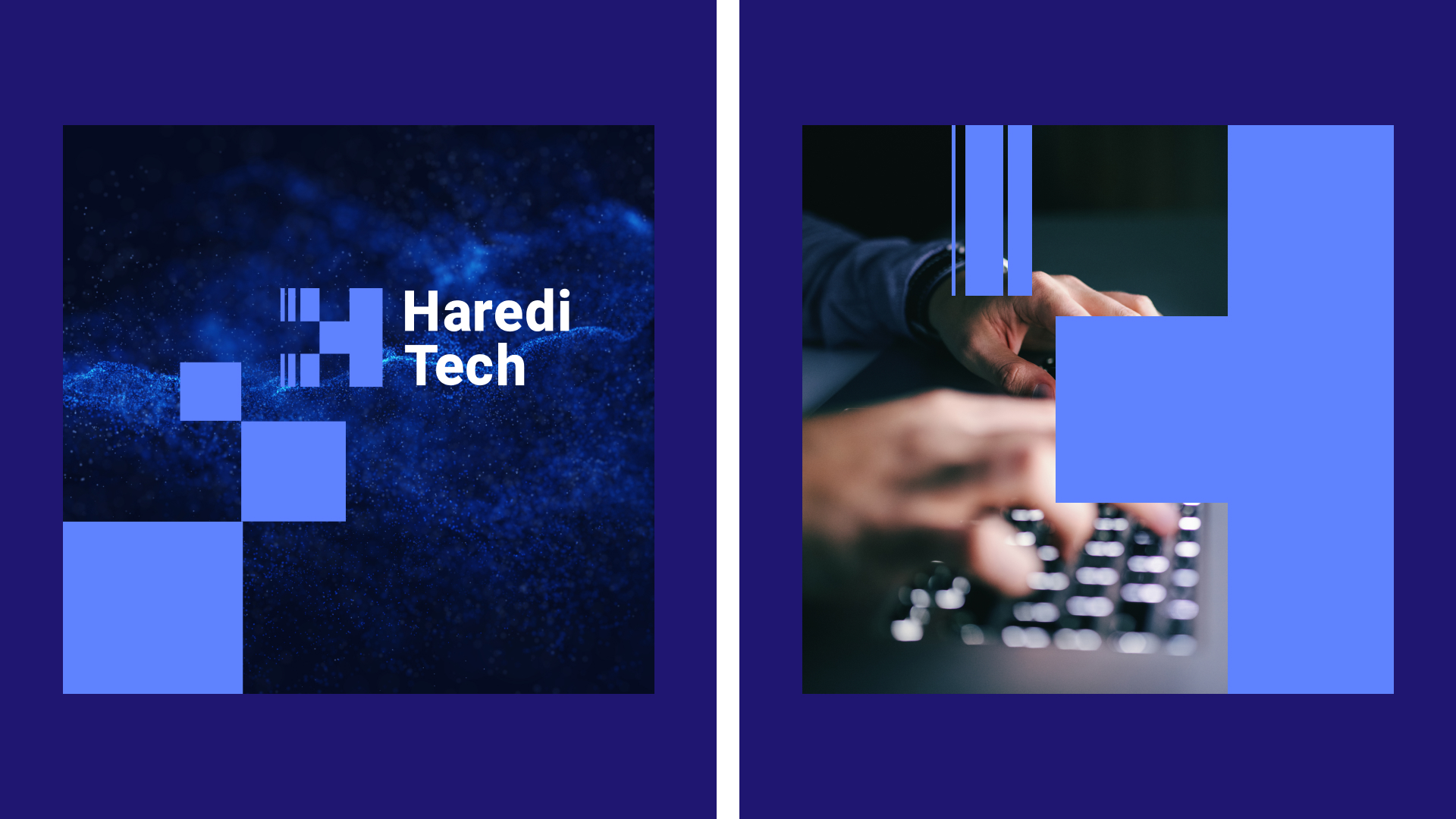
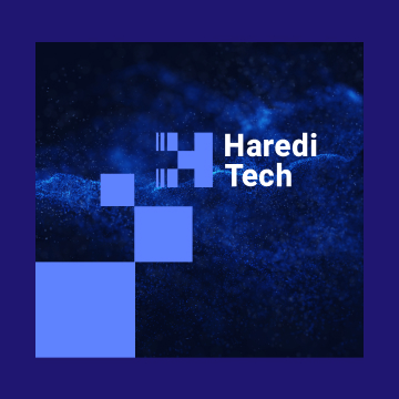
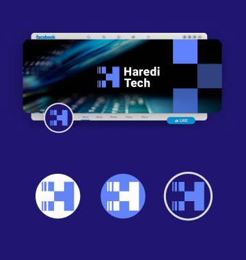
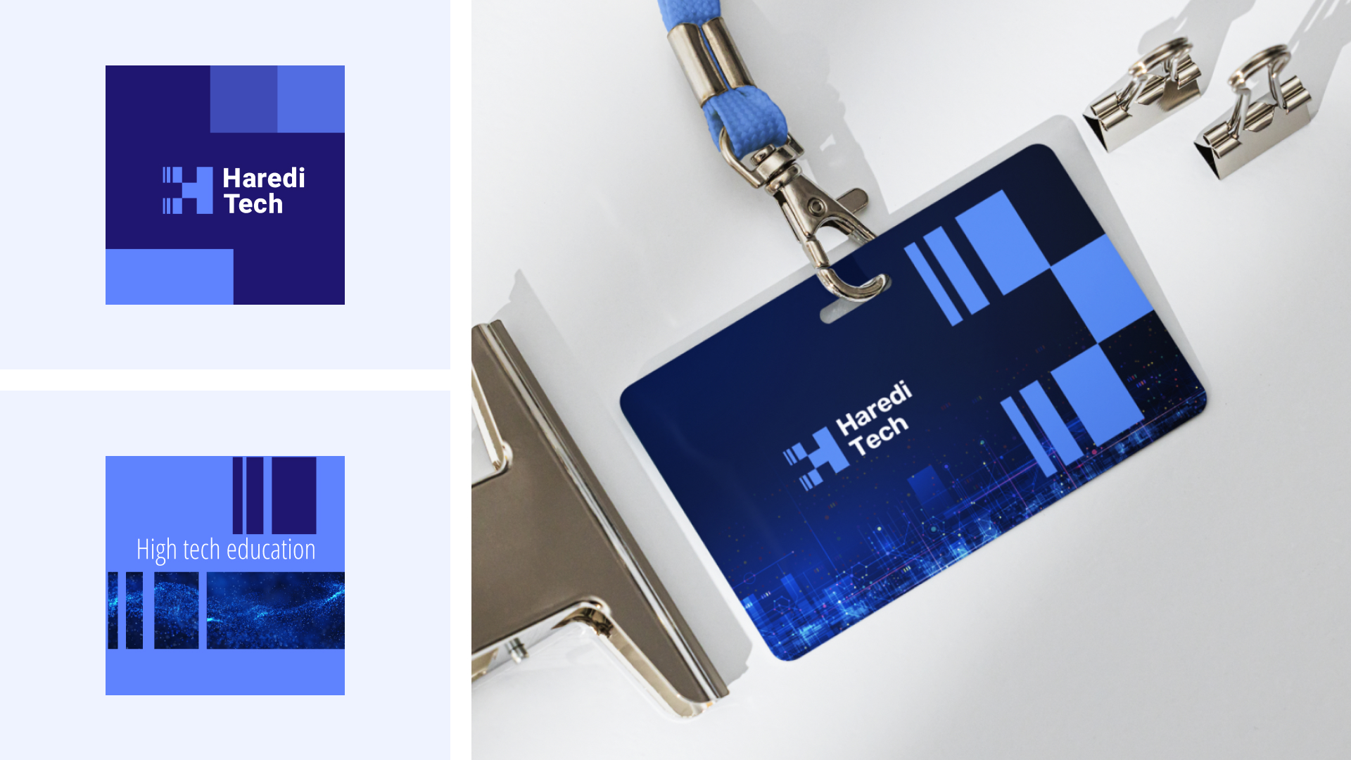
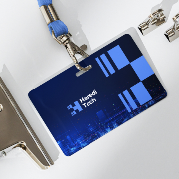
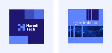
The client's choice was to move forward with a visual system based on windows. A window provides a lot of opportunities, and yet it also offers a safe glimpse into a new digital world.

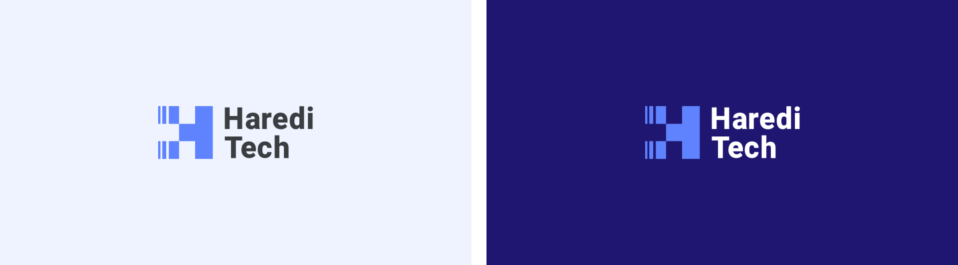
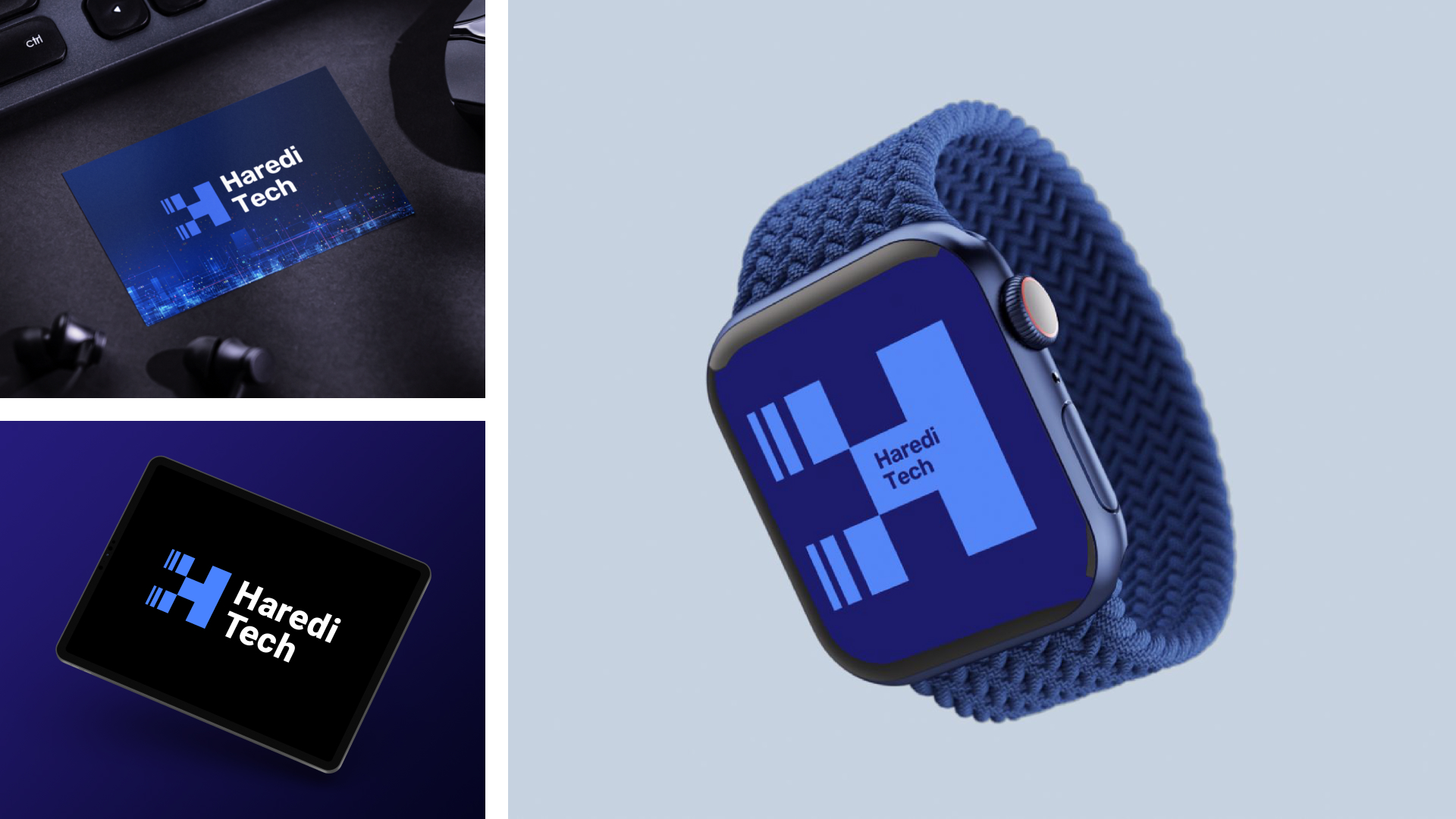
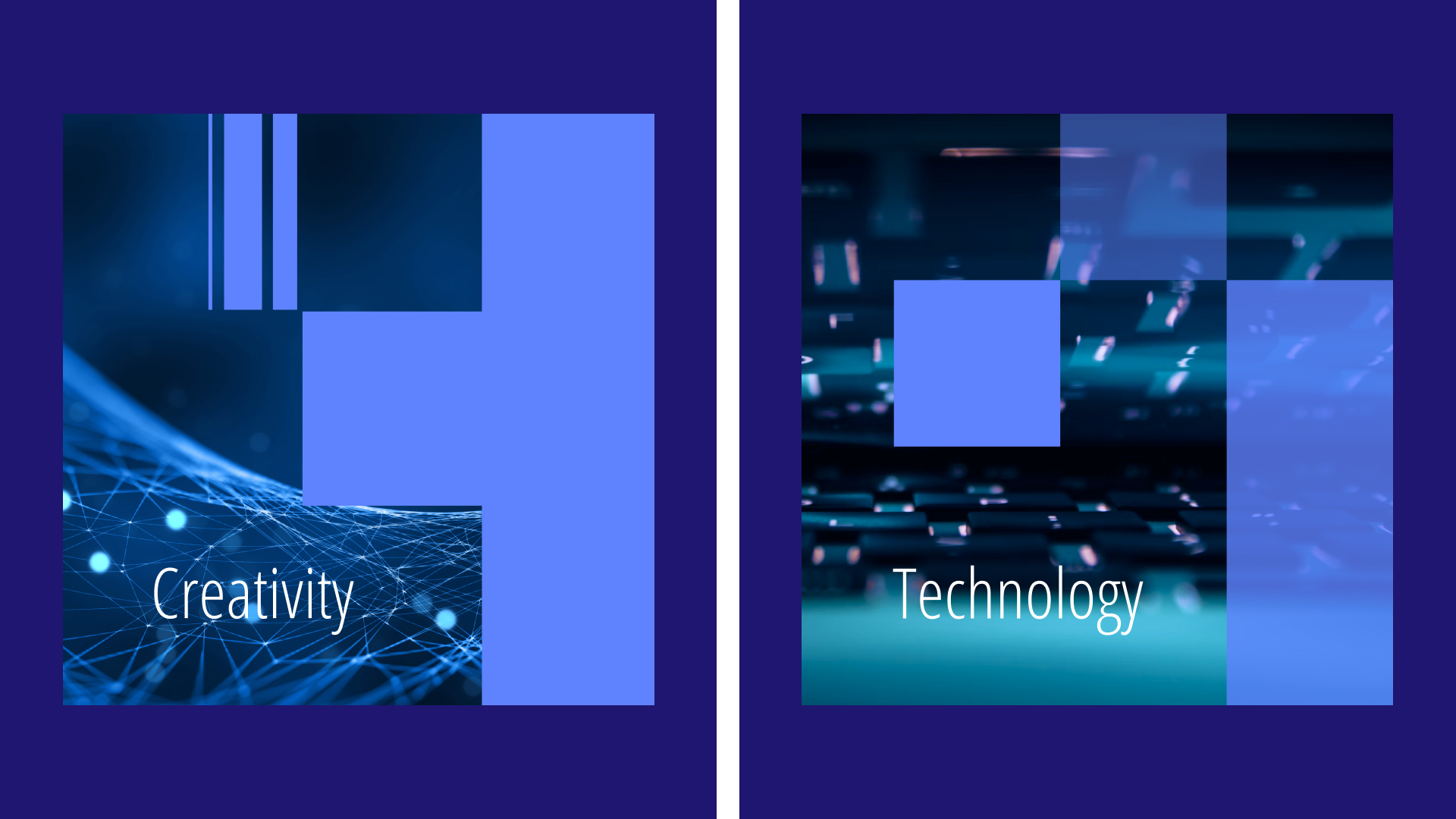
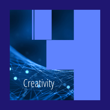
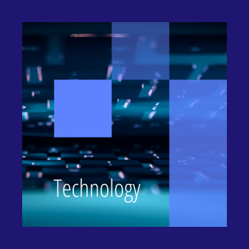
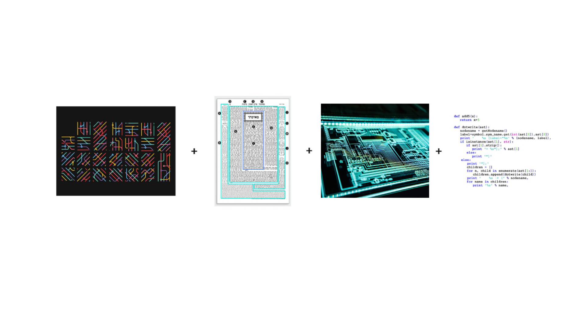
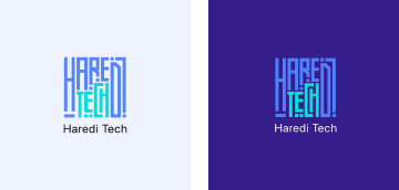
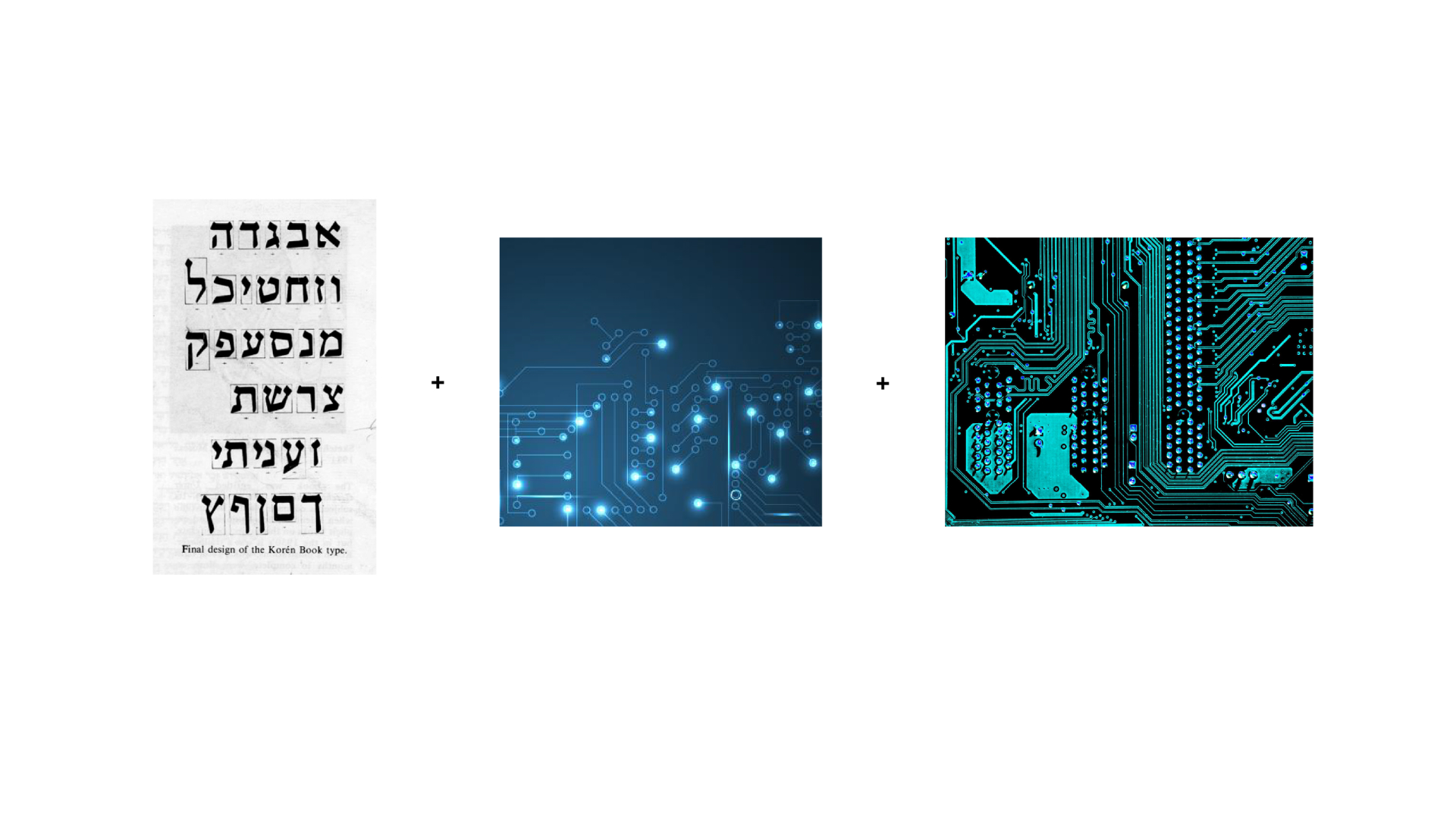
Good logos have more than one level of meaning, and here we utilized pixels and multiple tabs as an image of the digital age and the accumulation of knowledge.

Hidden symbols

We have integrated the main letters of the project's name - H & T into the logo itself

Credits

Shira Schapiro

Art Director

Tetiana Kholbobaeva

Design Team Lead

Yulia Moroz

Graphic designer

Maksym Kuzmenko

Creative Director

Olena Sergeeva

Graphic designer

Kristina Naumenko

Project Manager

From the lavender field to the
recreation park:
360° campaign for Poradiv Park
Brand strategy | Logo update | Branding &  SMM kit | Website | Communication strategy | Creatives for promo
Histogram. The unknown history of Ukraine
Creative idea | Naming | Logo | Website